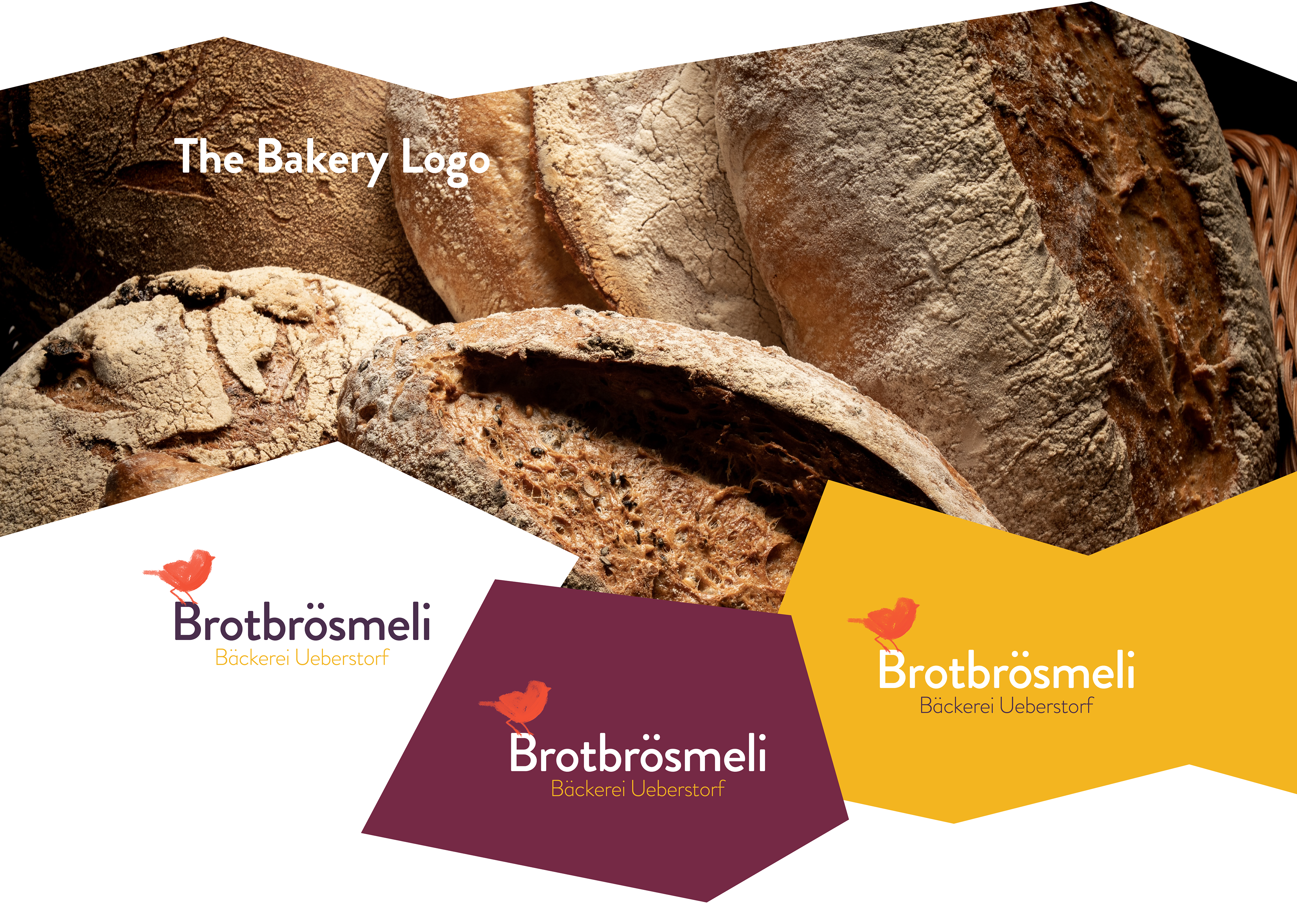
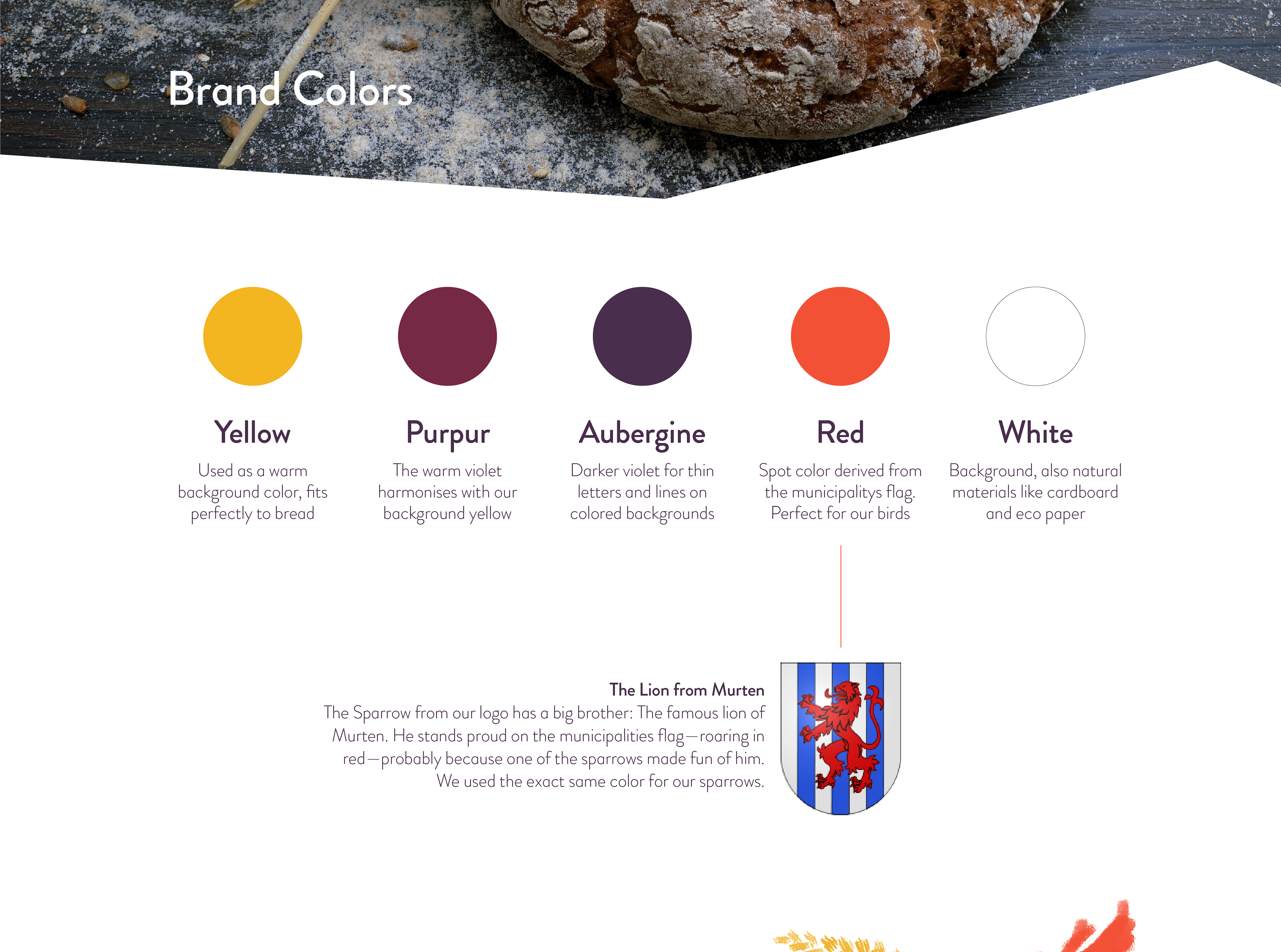
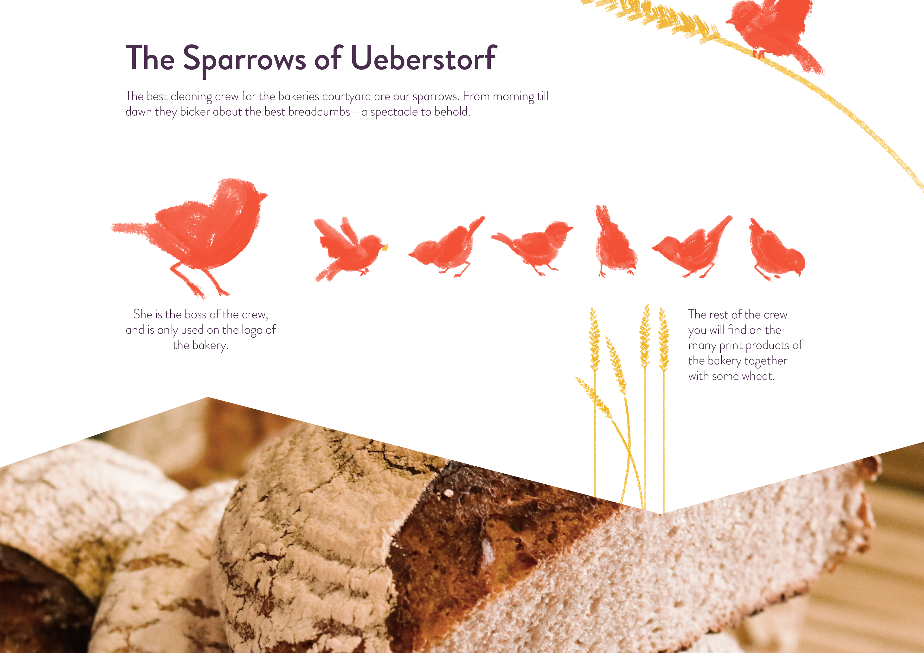
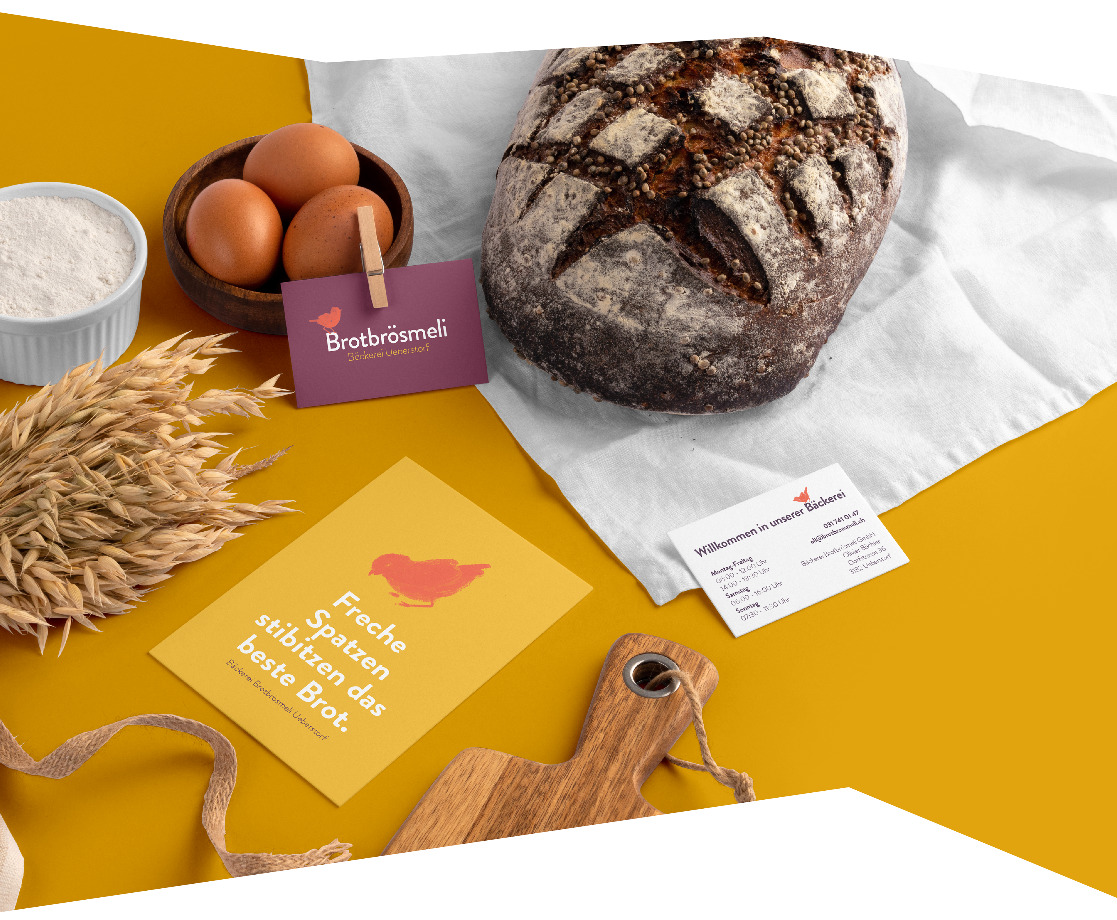
The Brief was simple: Create a branding for a Swiss countryside bakery with their main symbol: The breadcrumb. "Brotbrösmeli" literally means "small breadcrumb". The brief was simple, the task was not: Early attempts with drawing breadcrumbs in a stylized or abstract form never looked very good. This is why we were contemplating alternatives around the bakery—while the sparrows were having their breadcrumbs for lunch behind the bakery—and the idea was born. We illustrated a sparrow, in the same color as the lion in the municipalities flag, that looks like he is on the lookout for more delicious breadcrumbs.
Branding, Illustration and Visual Communication for a Swiss Countryside Bakery
Brief: A small bakery with a staff of 10 was in need of a whole rebrand, except the name "Brotbrösmeli" (which means small breadcrumbs in Swiss german) which they wanted to keep. After an extensive brief with the client it was obvious the the family owned bakery needed a warm and soft feel with the possibility of introducing some cheeky element. It needed to be easy to understand for a more rural environment and—if possible—kids friendly.
Client: Bäckerei Brotbrösmeli GmbH, Ueberstorf
Year: 2020
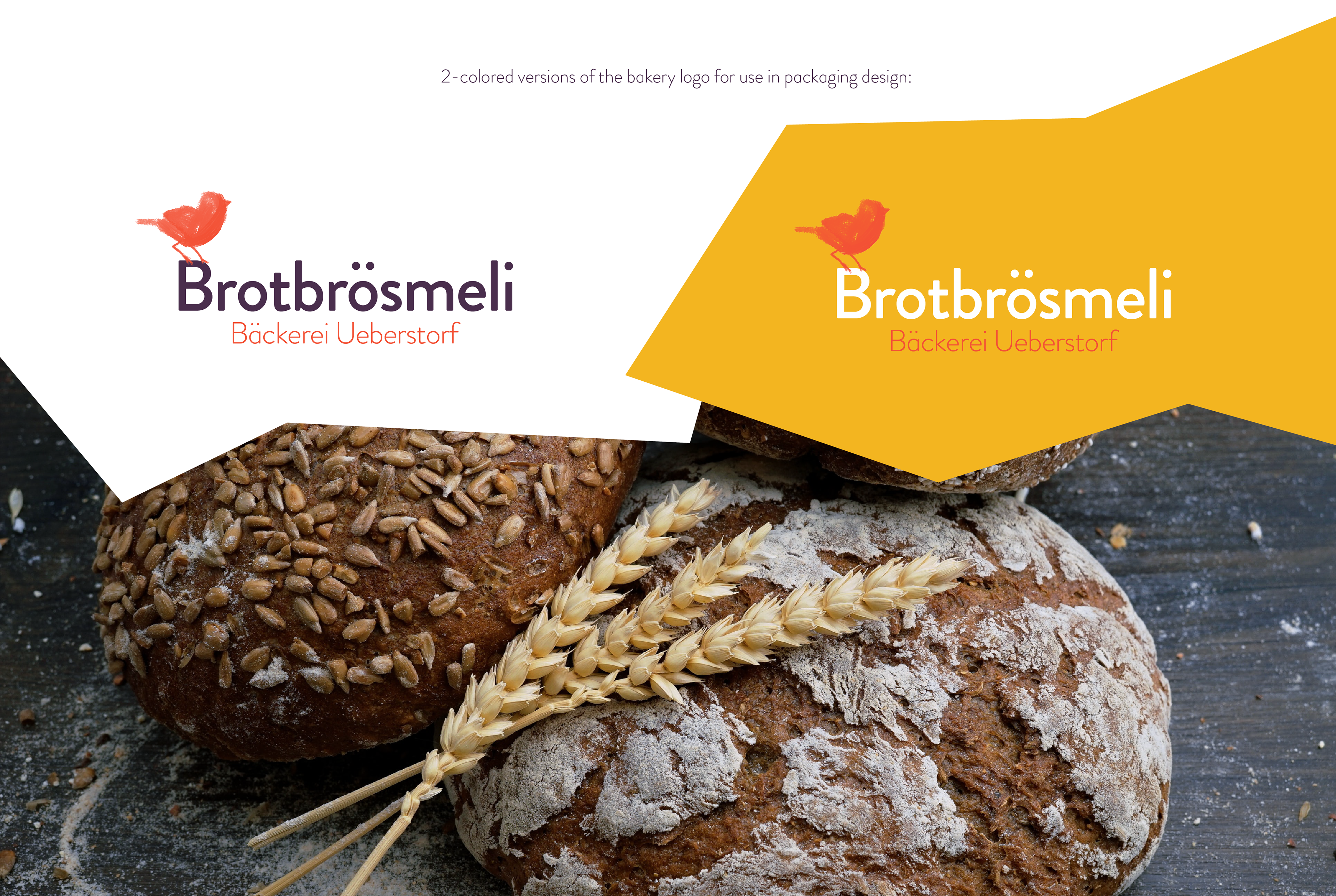
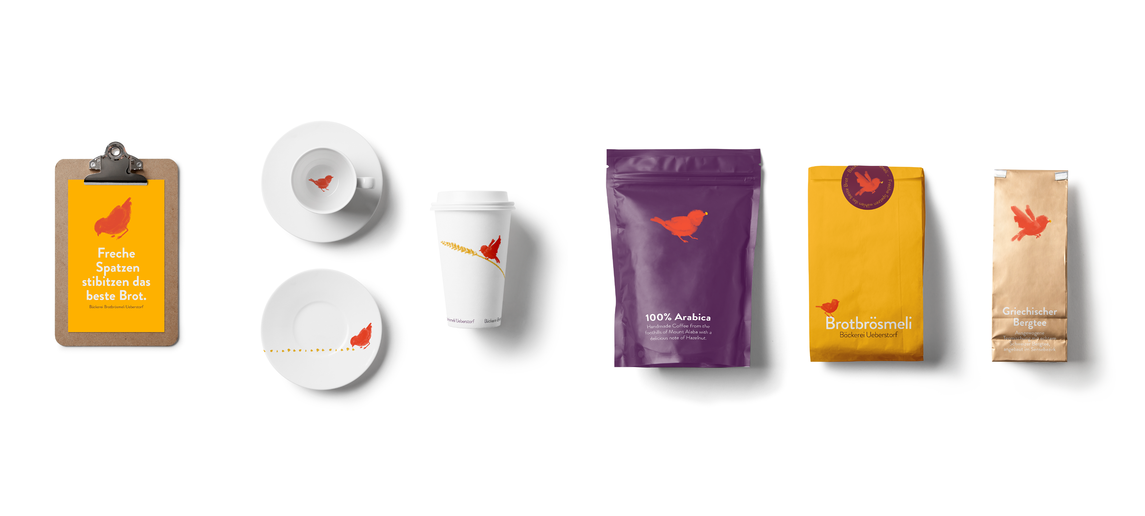
Services: Art direction, illustration, branding, layout and graphic design, packaging design and print pre-production for numerous products.
Design and Illustration: Pauline de Langre, Michael Berger (K-tiv.com)